Moose & Squirrel get a facelift.
client
Bullwinkle's Family Fun Centerservices
- Brand Extension
- Directional Signage
- Environmental
- Illustration
The Project
Vintage style, modern look.
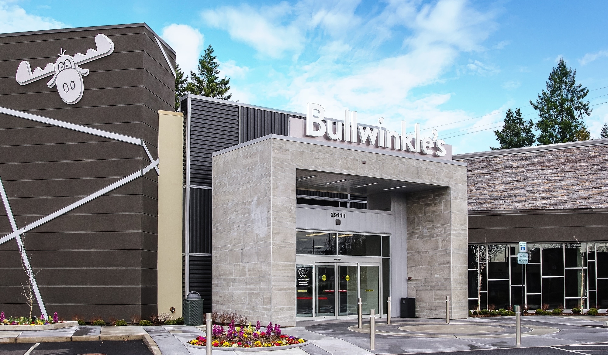
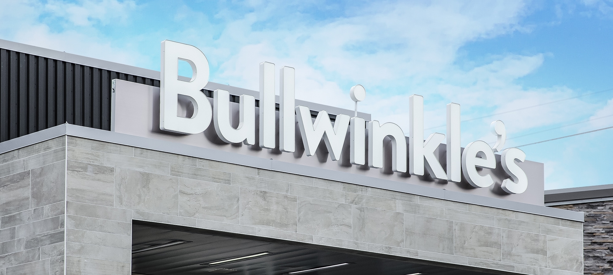
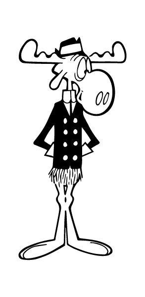
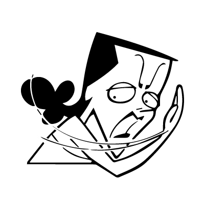
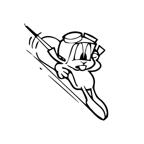
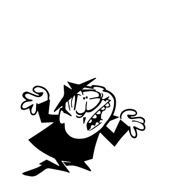
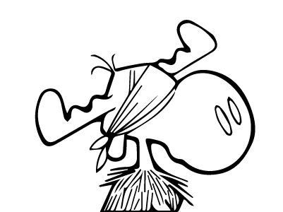
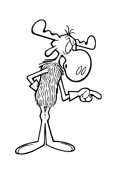
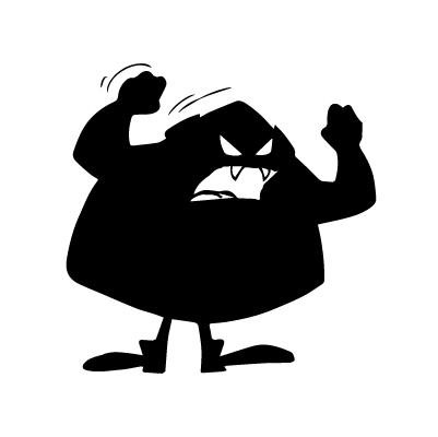
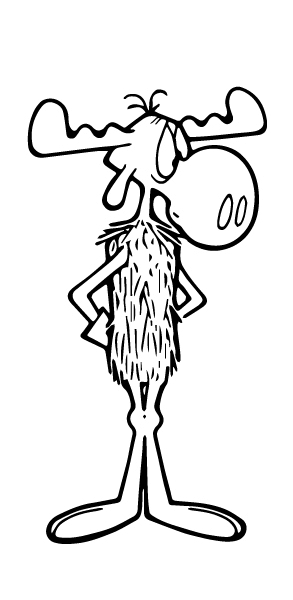
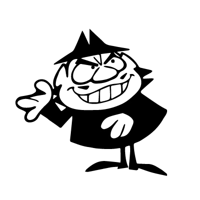
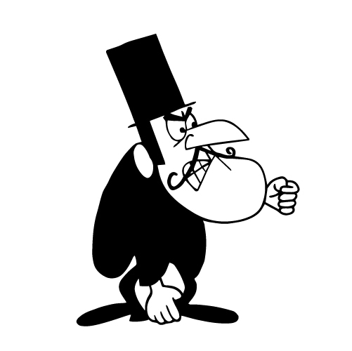
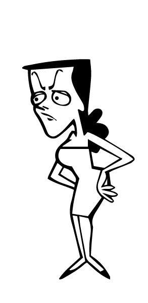
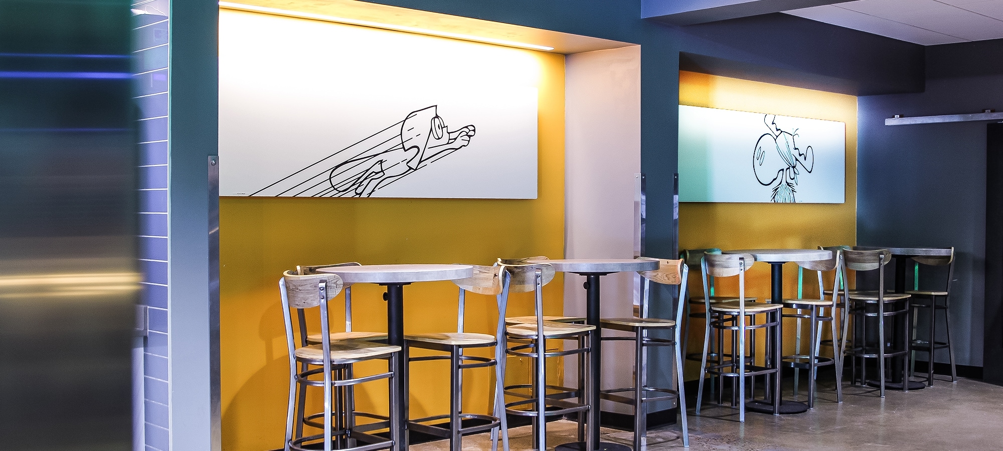
When we were first approached by Bullwinkle's Family Fun Center, they had an updated logo created and were looking to match the interior. As the first renovation to the space in decades, the whole center was to undergo a facelift. With updated bowling lanes, laser tag obstacle courses and a new dedicated bar space, Bullwinkle's was ready to welcome families and adults alike (well, almost). The current space was adorned with the first animated versions of the cartoon. In the redesign, both the owner and we agreed throwing back to the style of the original Al Kilgore illustrations would make the space look both modern while heralding it's history. A new bold color palette replaced the previous pastels of the 80's, while characters were simplified in black and white. From way finding to wall coverings, the new look is both adult and kid approved.
objective
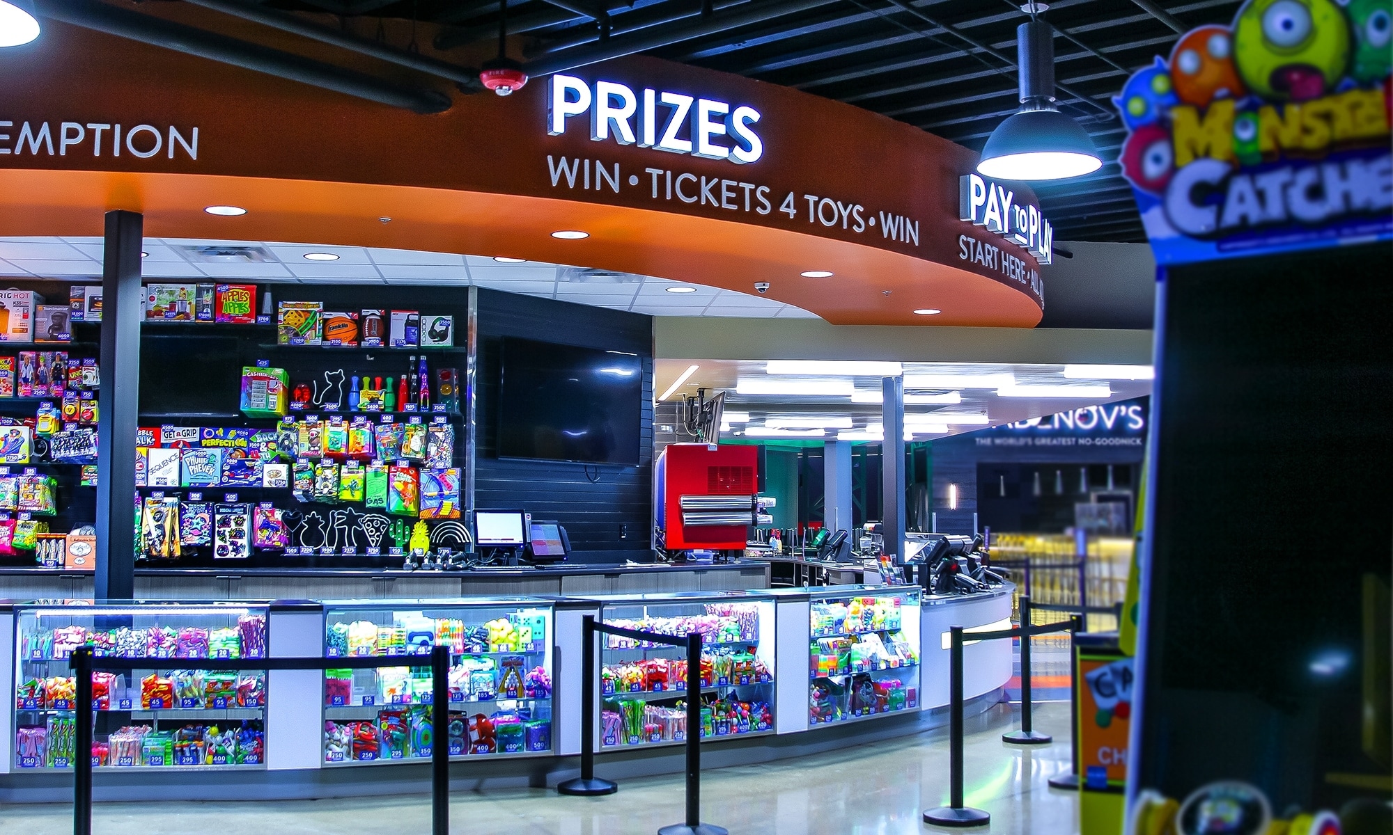
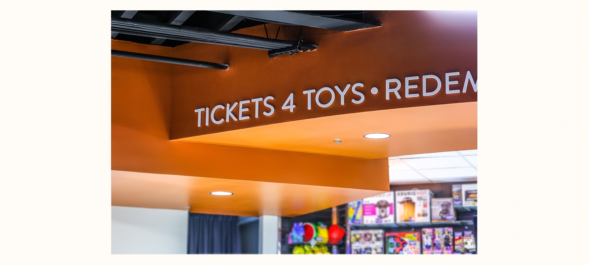
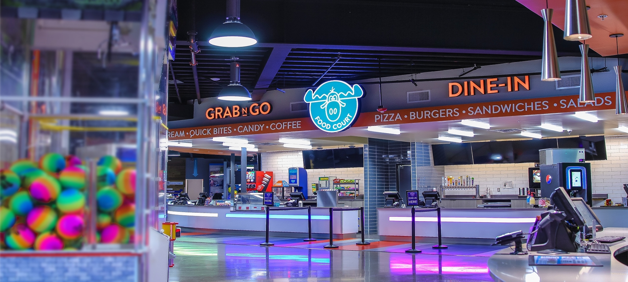
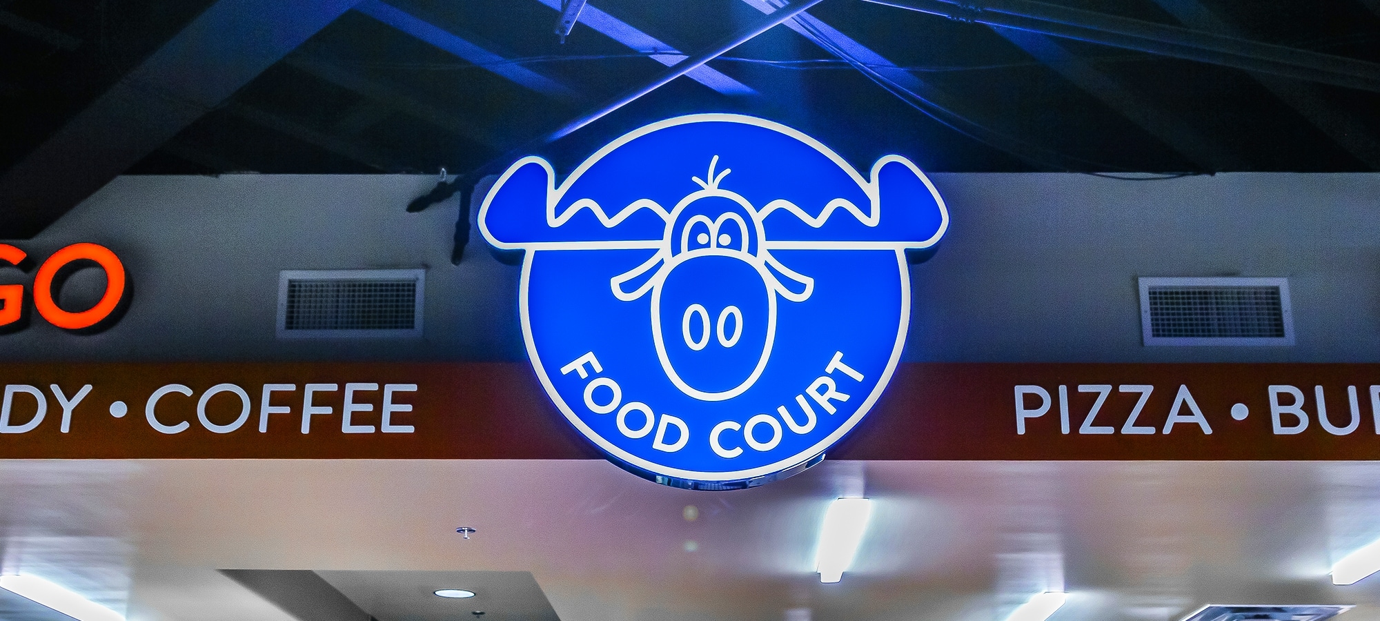
Fun with Wayfinding
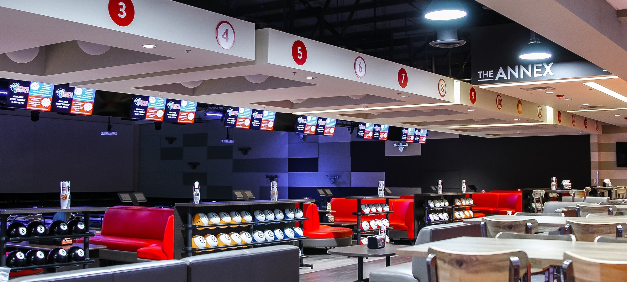
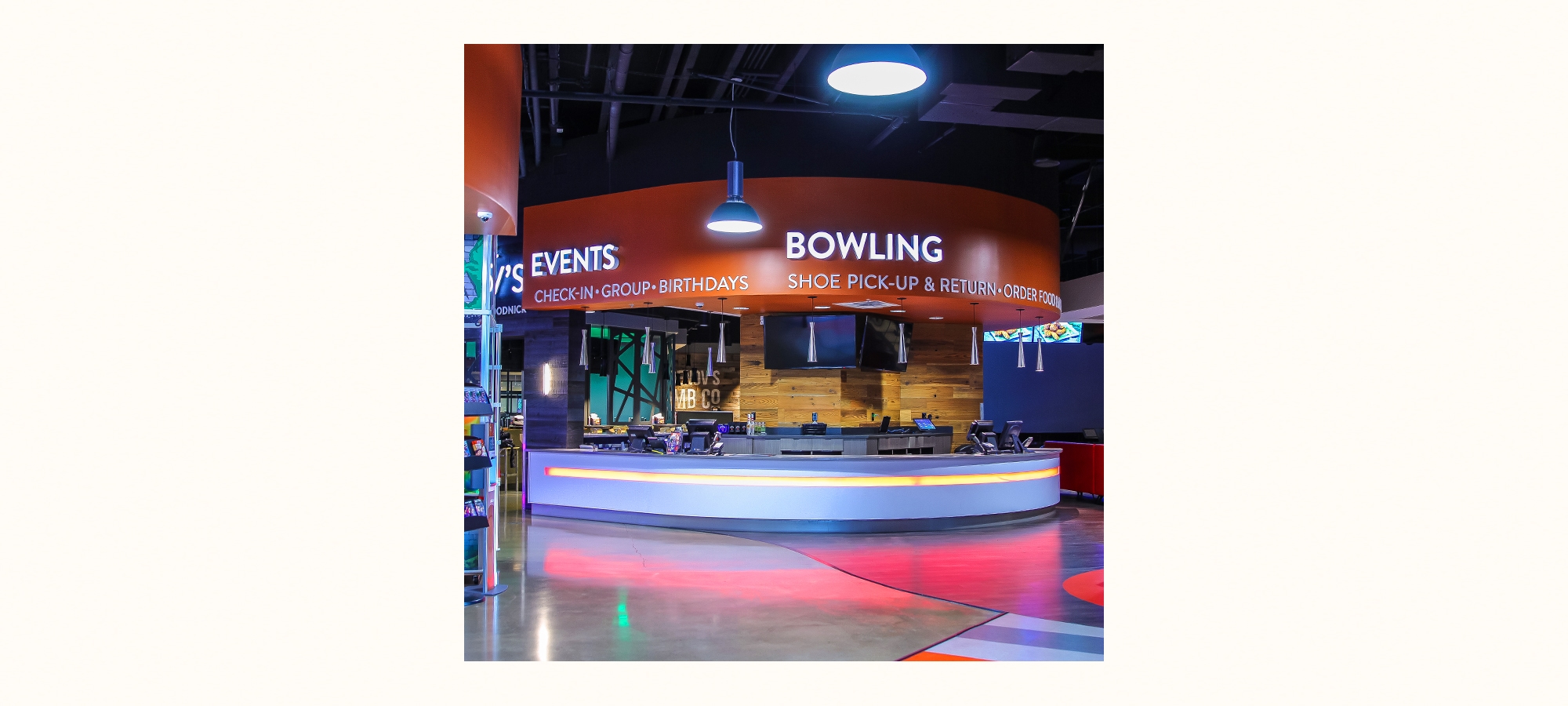
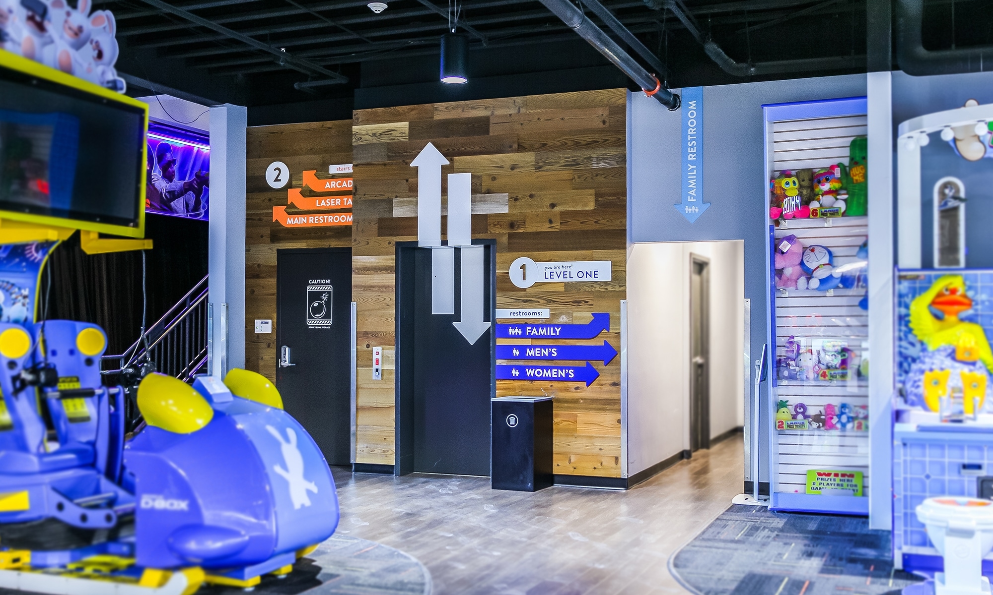
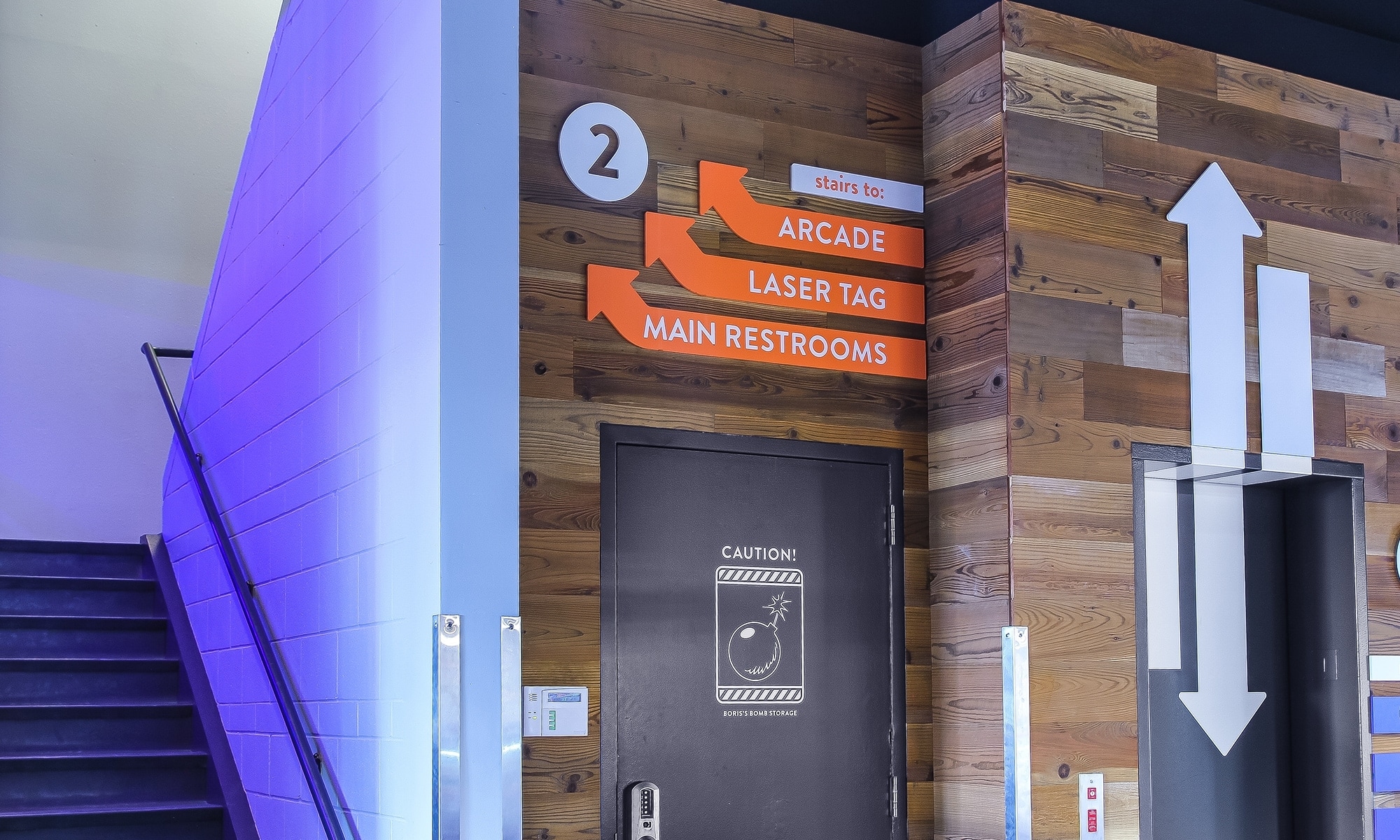
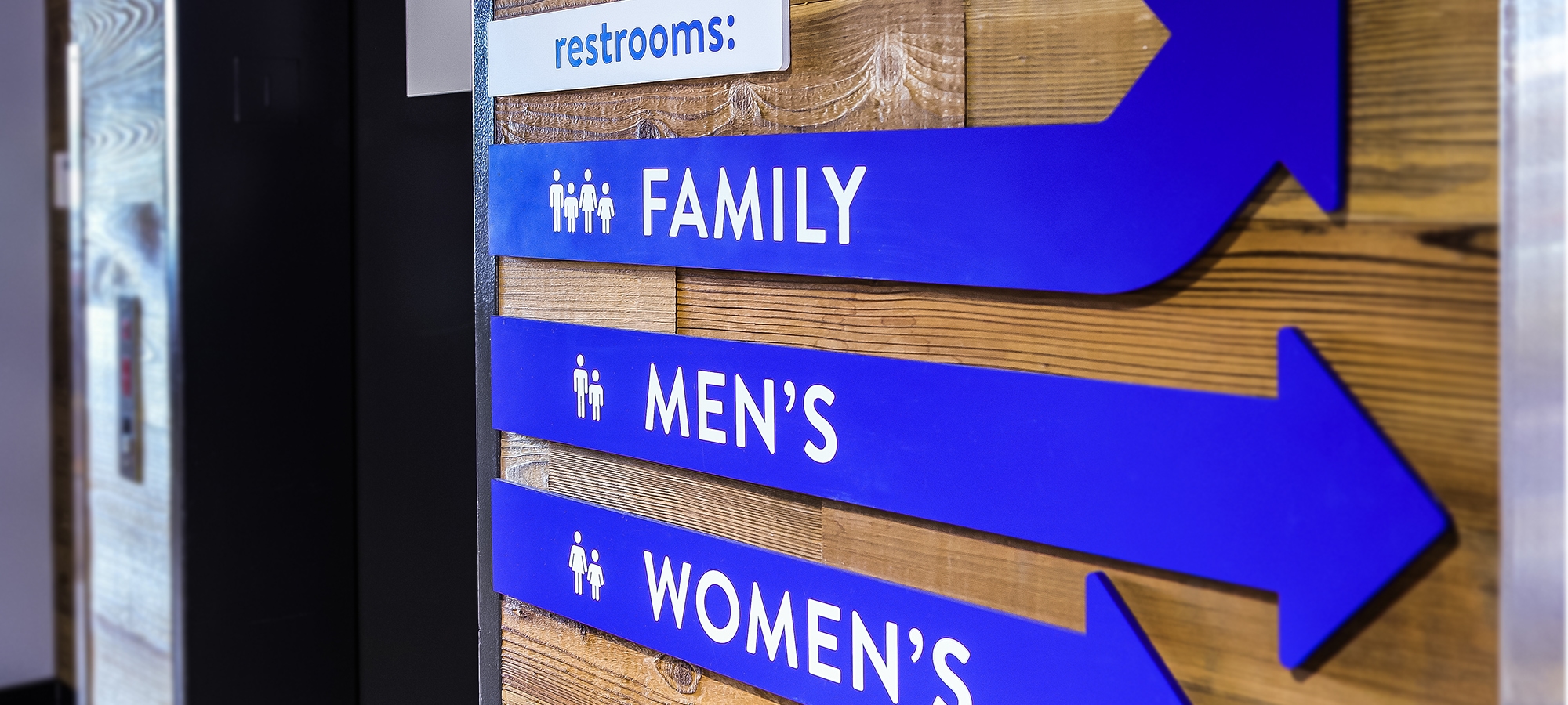
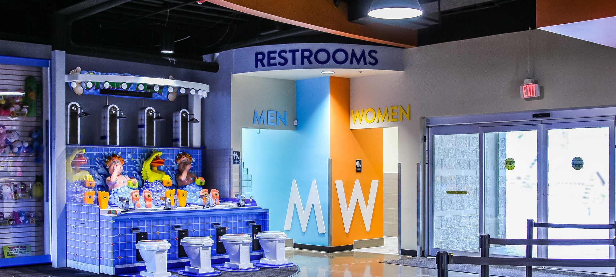
The primary objective for the new space was to assist guests in finding their way around. Because the biggest demographic was below the age of 18, we needed to make sure the graphics and signage were easy to read and had staying power. By working tightly with the signage fabricator, we selected materials that were hard to pick at, scratch resistant and simple to touch up or replace, when needed. Easy to read (yet fun) typefaces were selected and blended with a wide color palette to give flexibility within the system.
Characters
Making vintage usable
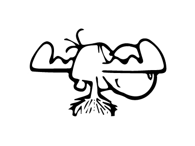
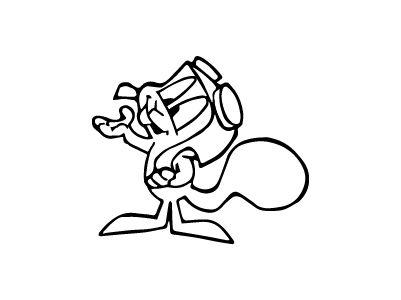
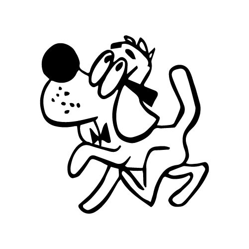
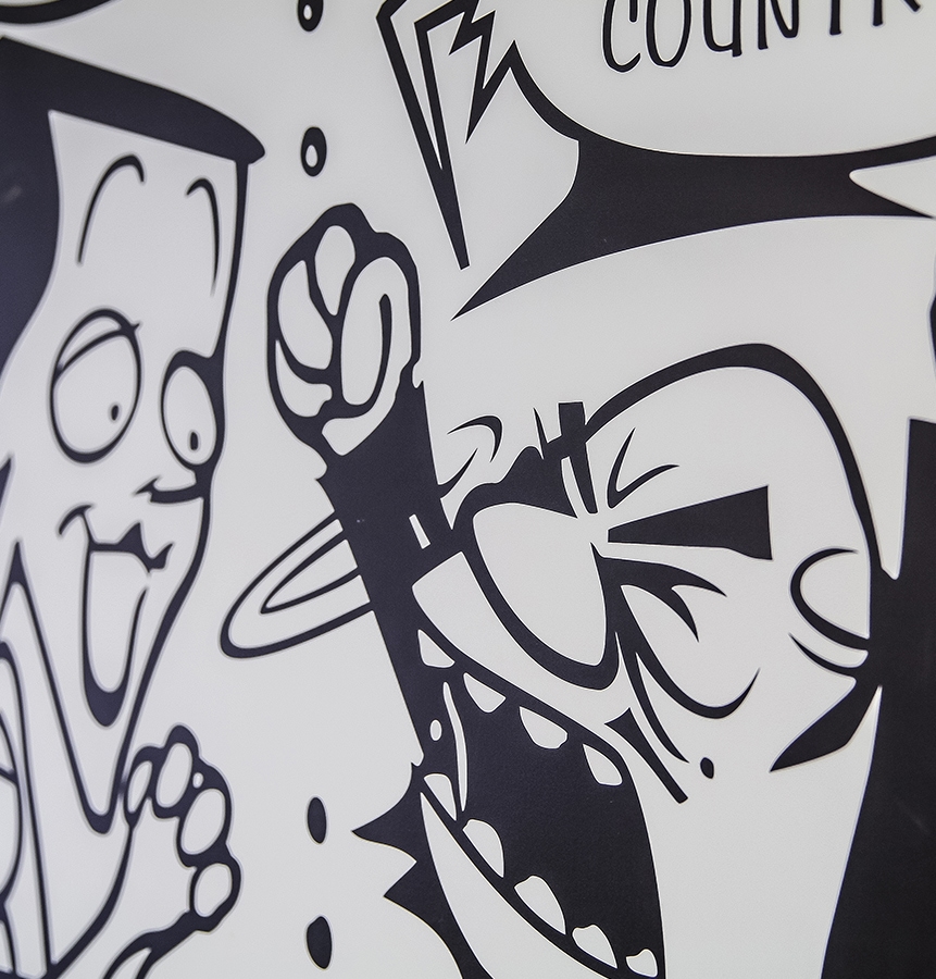
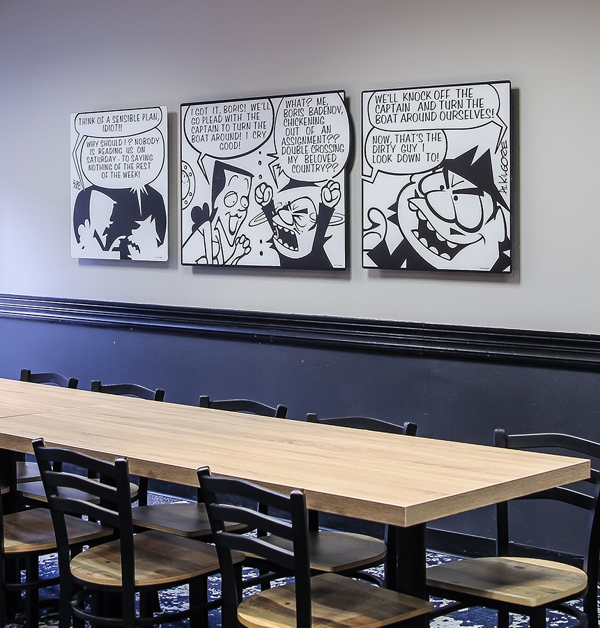
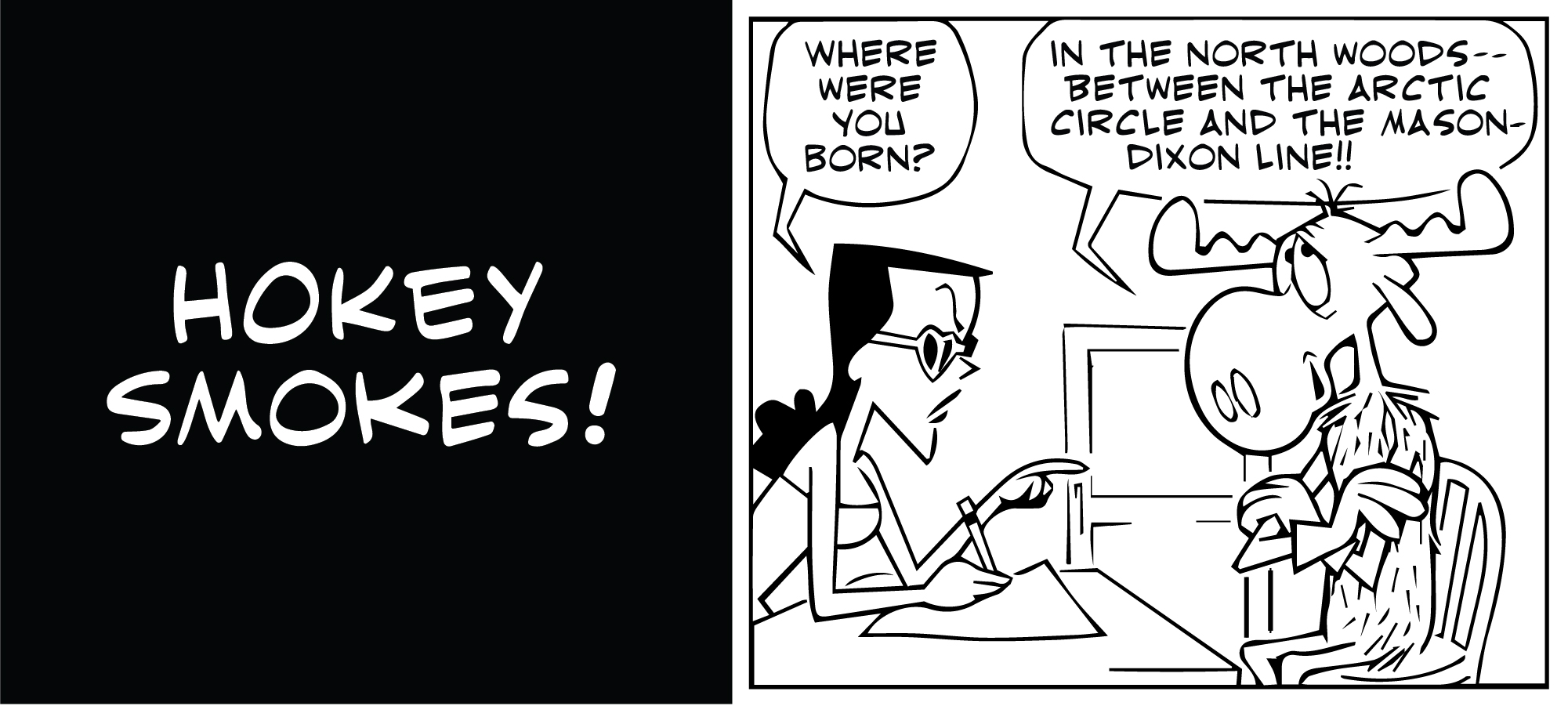
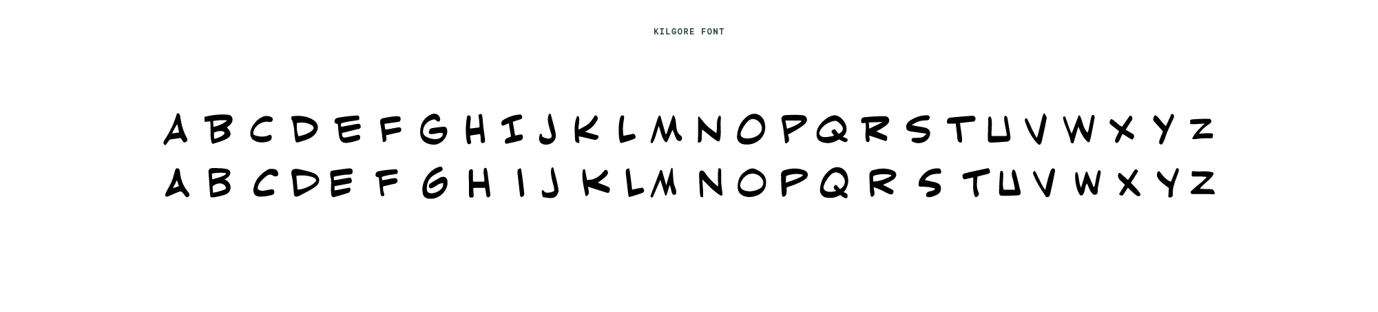
Although the Fun Center had rights to use the characters from the Adventures of Rocky and Bullwinkle, acquiring art can be a challenge. We created a library of characters, Al Kilgore comics and even created a "Kilgore" font to assist in the reproductions. By giving the characters the "vector" treatment, we were able to scale anything we needed to fit a 12 foot wall or canvas, without pixelation.
Hiding undesireables
Making a statement (wall)
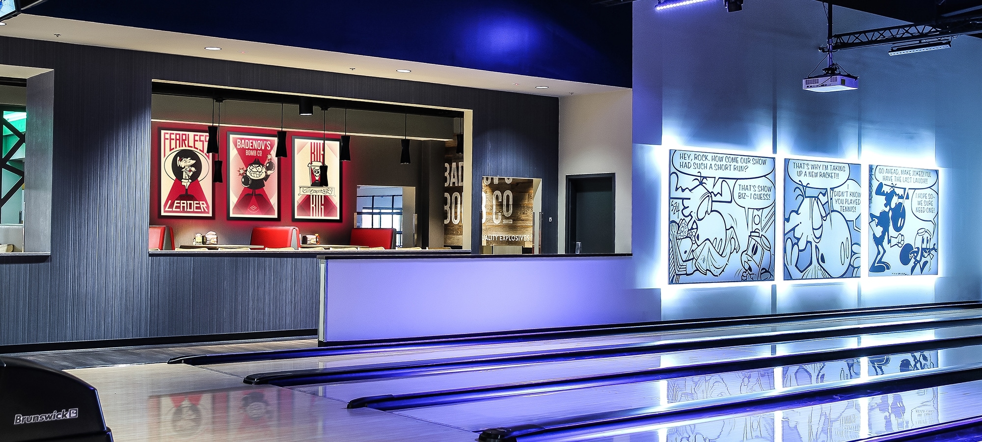
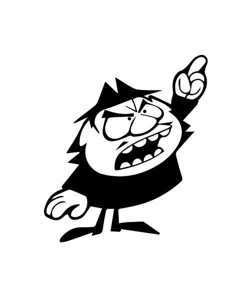
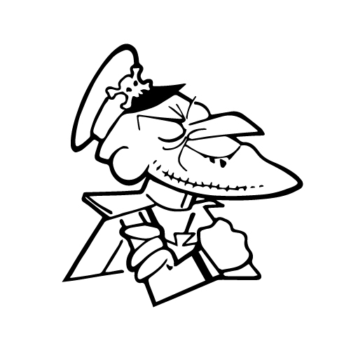
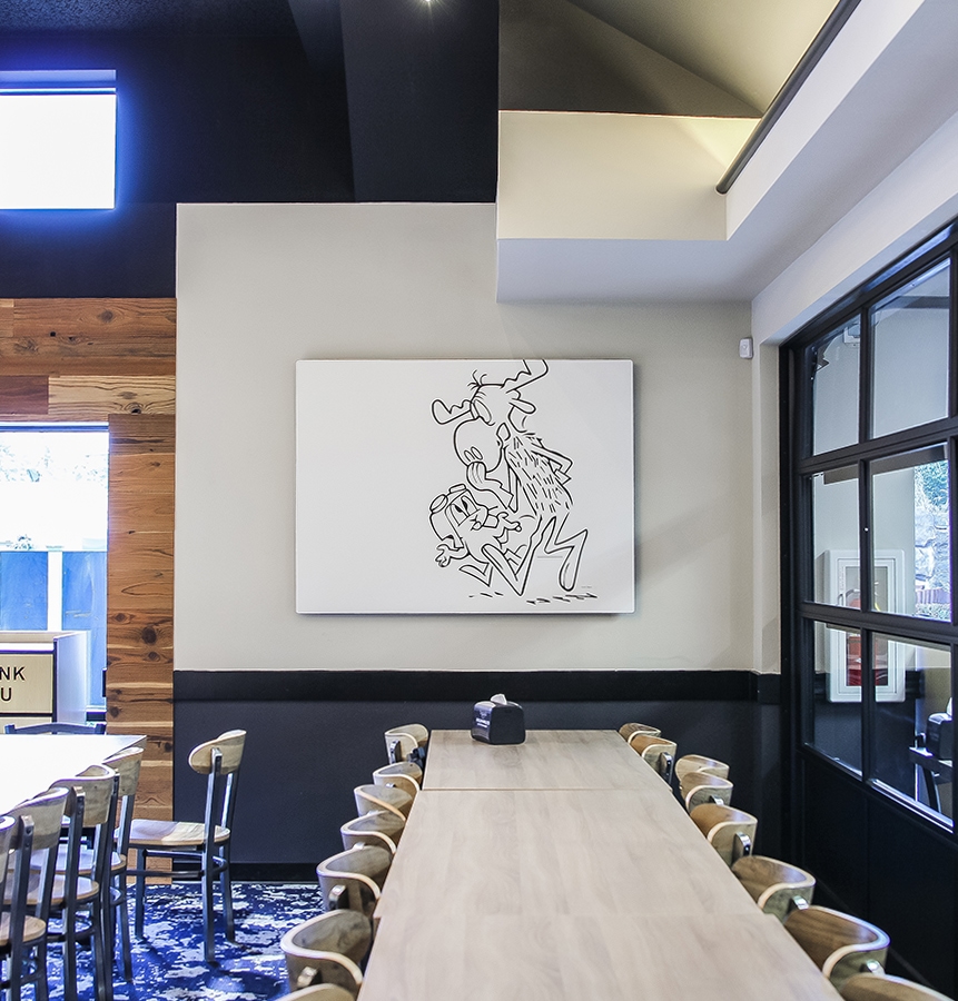
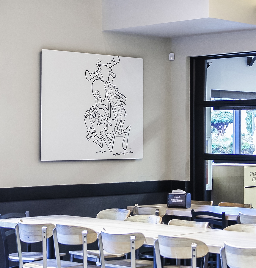
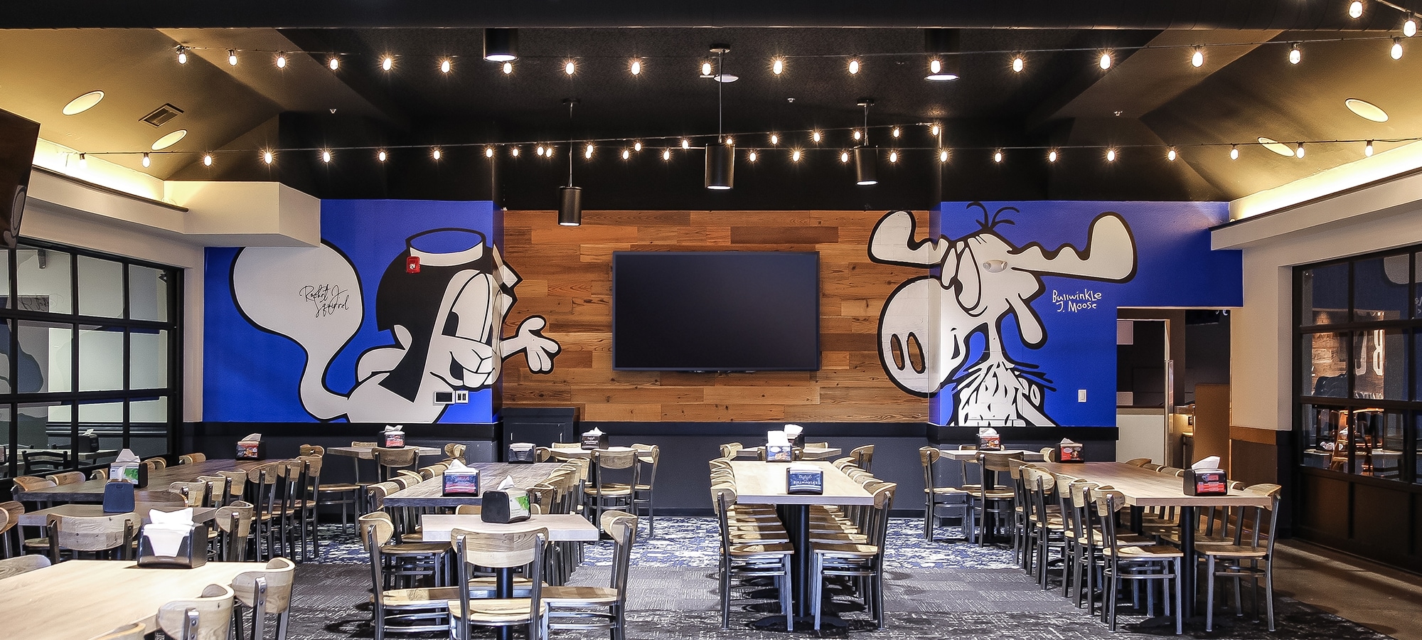
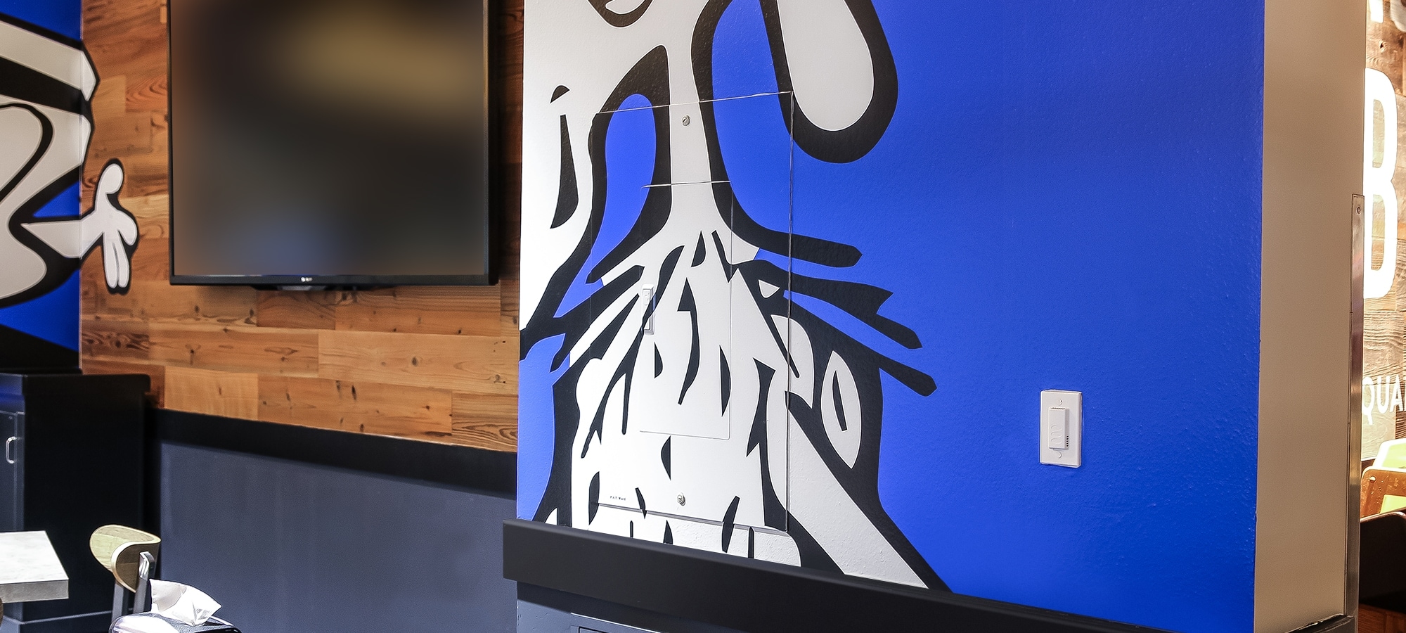
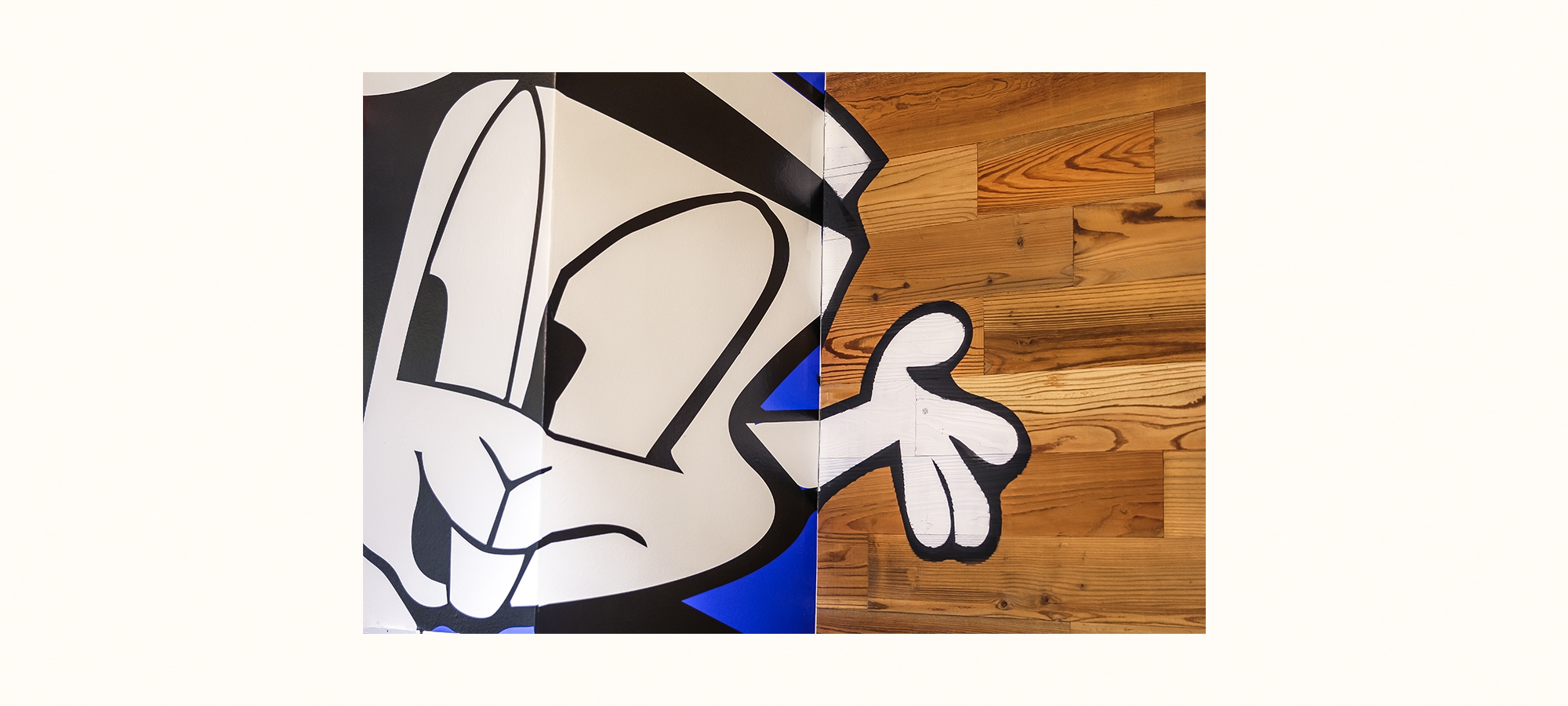
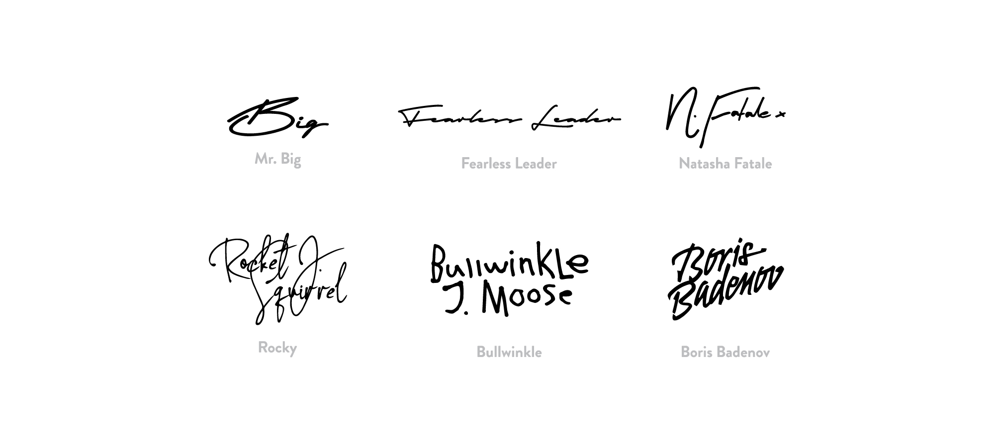
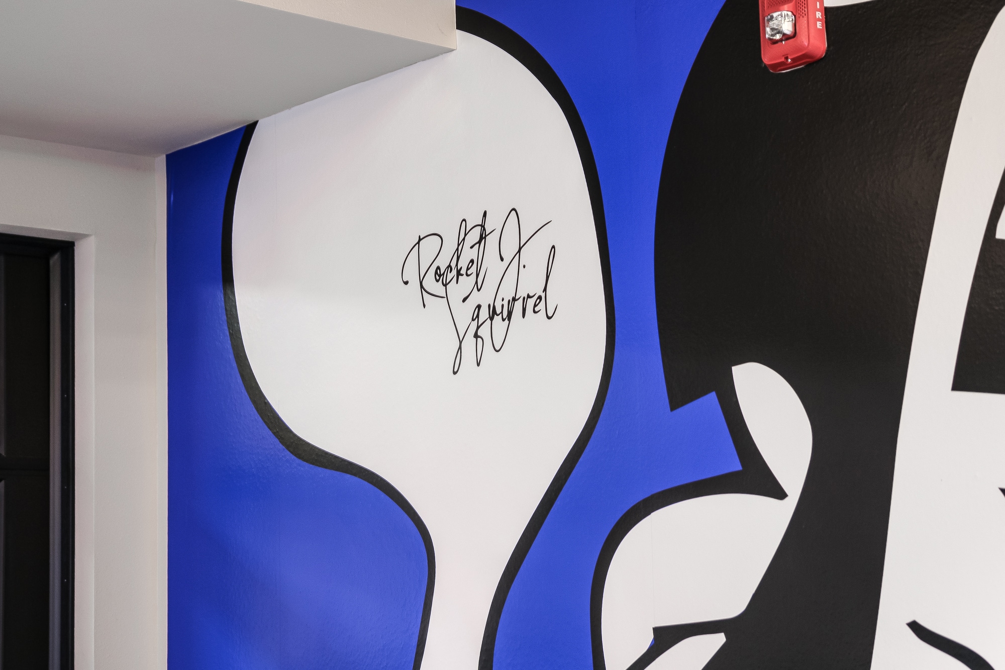
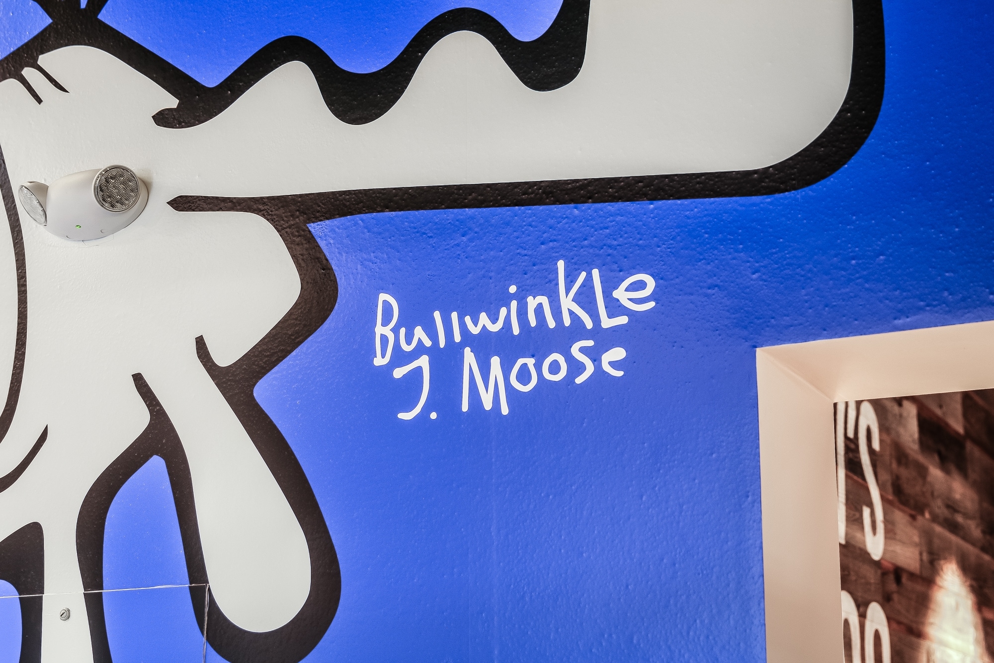
In the largest dining room, the client wanted something eye catching and fun. Because it was one of the largest wall spaces we had, we knew it would be the perfect place for the flagship characters. The wall was a challenging shape due to an inset in the middle (which was also to be outfitted with a TV) along with mandatory safety items like electrical panel access, emergency lights and building duct work. Rustic wood tables and chairs had already been selected for the space, along with a gray and blue carpeting. To give the walls presence and bring an intentional feel to the inset, we chose a cobalt blue to balance the grays as a base, while incorporating leftover wood from the elevator walls to the TV wall. The Rocky and Bullwinkle characters selected for the walls were assessed for their shape, white space and proportions for each wall, along with their ability to accomodate the mandatory mounted fixtures. Special attention was given to the perspective of the characters so that no matter where you are in the room, they look proportional from the front wall, to the back wood wall. Finally, to give additional delight to the space, we developed signatures for each character that are hidden throughout the center.
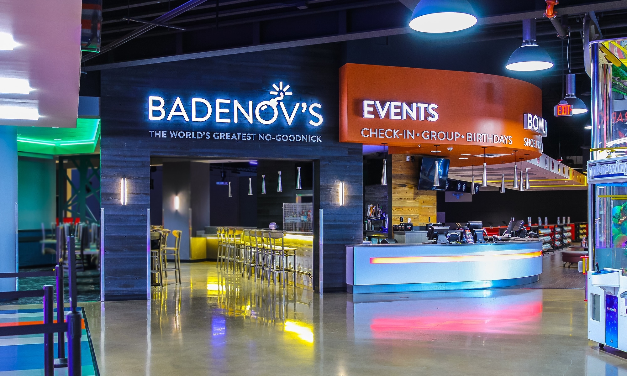
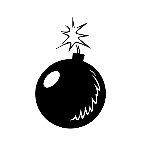
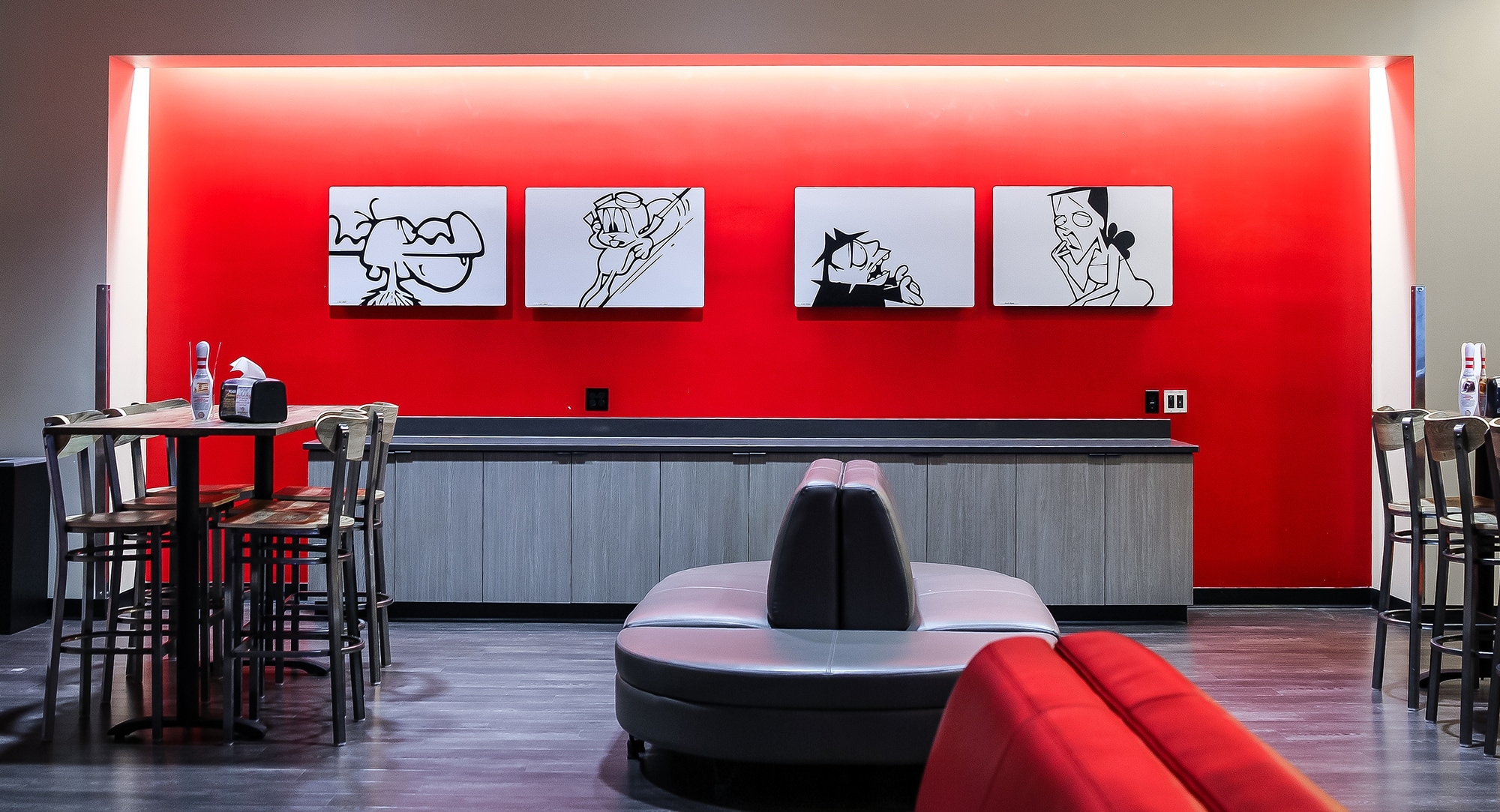
Adult Hideout
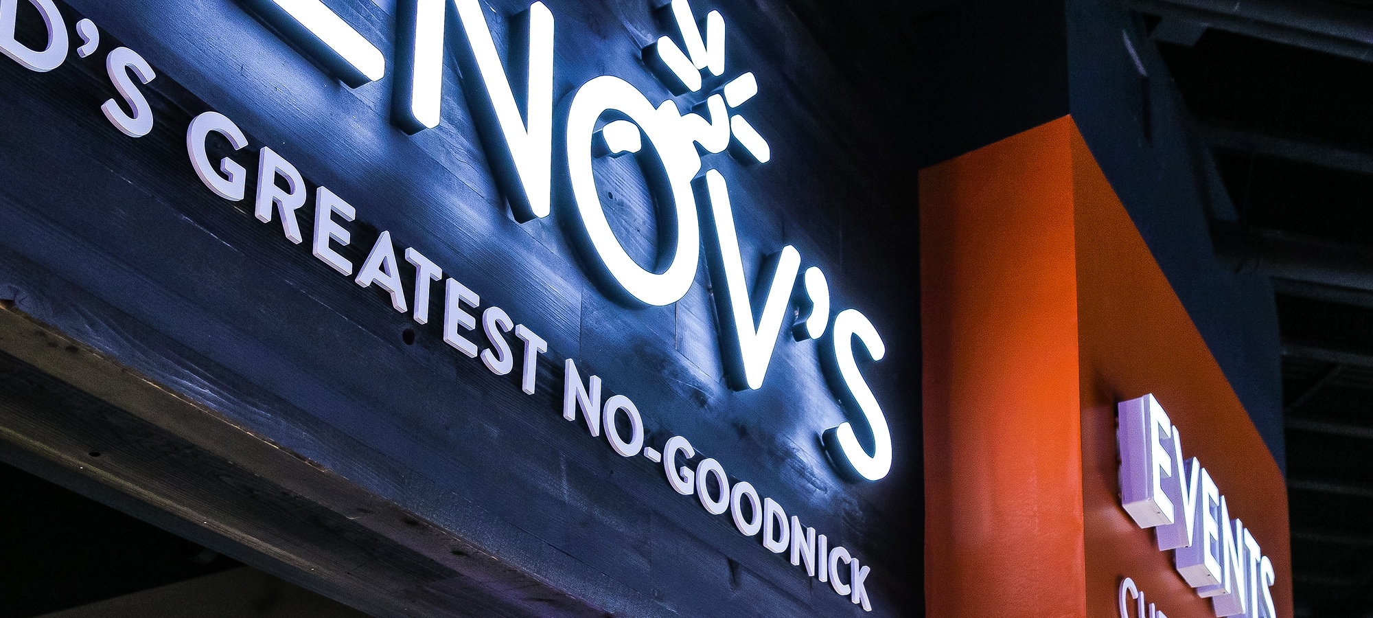
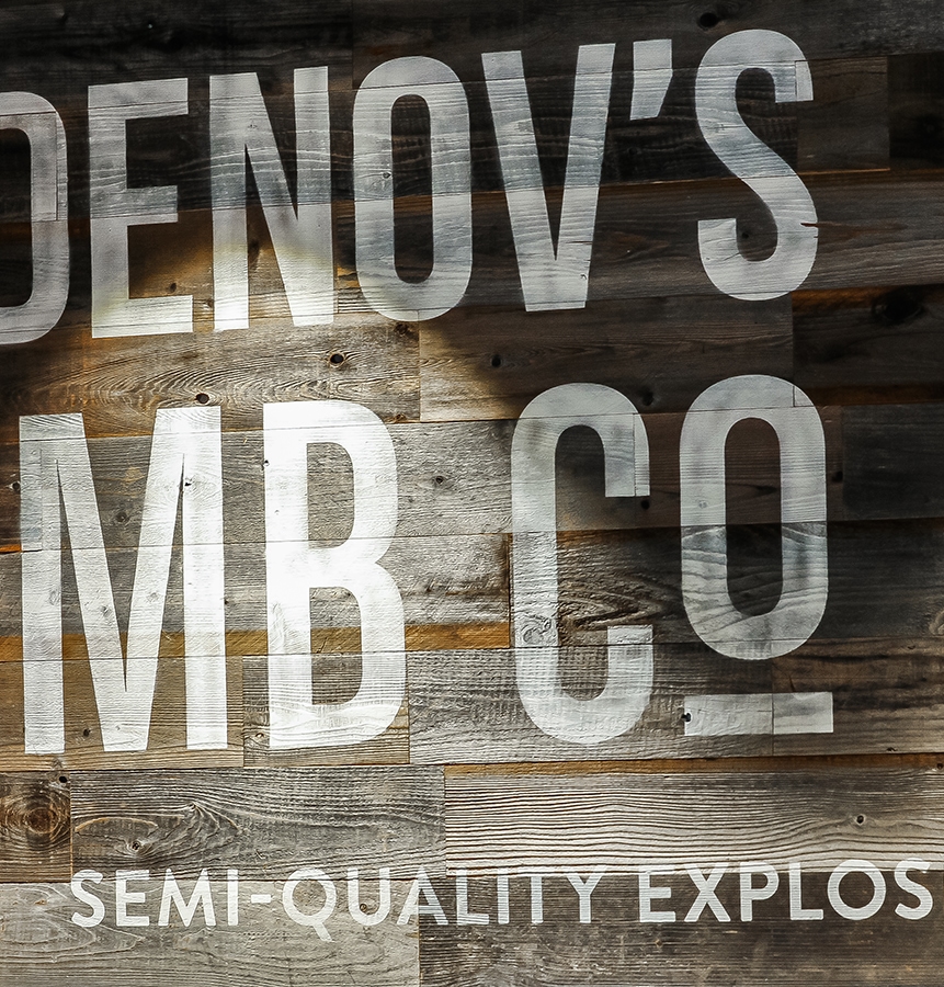
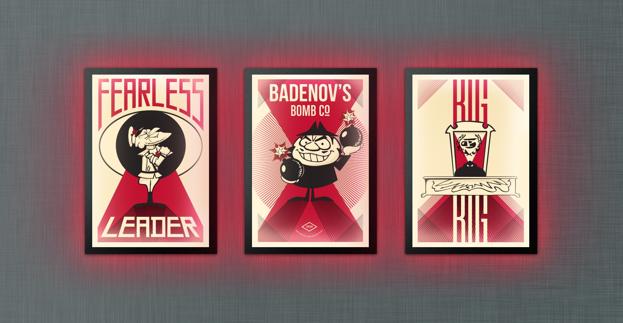
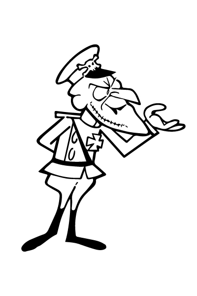
Get Bombed at Badenov's
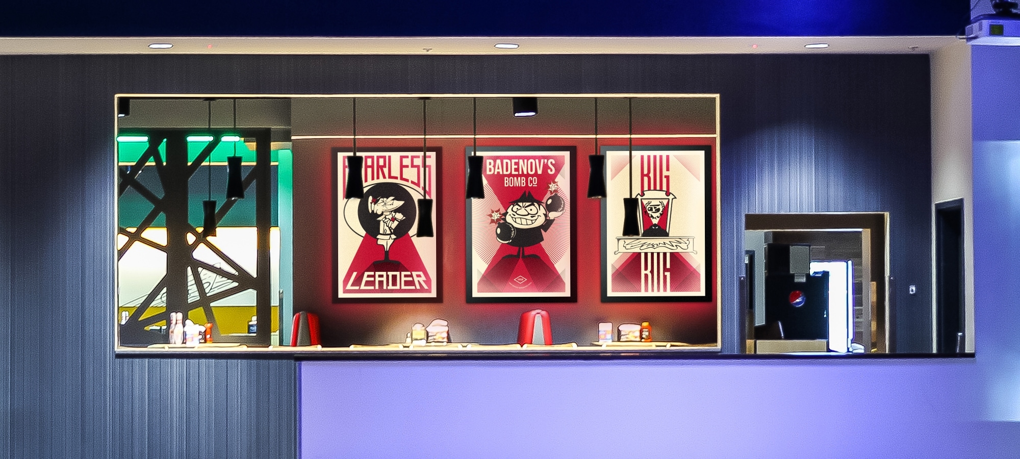
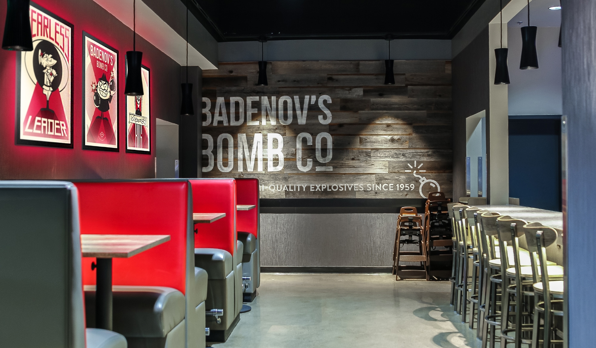
One key business goal to Bullwinkle's rebuild was to incorporate a dedicated bar to the middle of the center, where parents can have a reprieve while still keeping an eye on the bowling lanes and the main lobby. The owner loved the idea of the bar being operated by the villains in the cartoon — after all, they need a hideout, right? Pulling from the new logo and way finding signage, we created a new logo for the bar, along with adding a bit of humor to the walls. As a semi-quality bomb maker, Boris Badenov's name adorns rustic wood at the back of the bar. Also illustrated for the space, was a custom set of posters celebrating the worst of the worst.